My CAP pros in pictures...
Moderator: Senior Hosts
![]() by Yippie-Caiay » Tue, 10 Aug 2010 00:23
by Yippie-Caiay » Tue, 10 Aug 2010 00:23
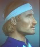
ok now that's a soderling, verdasco is great, didn't like djokovic especially from the side  , and i liked ferrer, but you could try to lower his eyebrows, and make his eyes look thinner..
- Yippie-Caiay
- Posts: 1099
- Joined: Fri, 12 Dec 2008 15:24
- Location: Bs. As., Argentina


![]() by Gemini » Tue, 10 Aug 2010 14:25
by Gemini » Tue, 10 Aug 2010 14:25
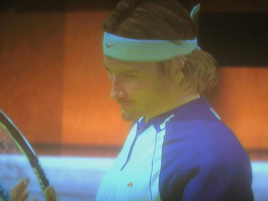
Think ive seen this Melzer from you before updated ya
hes good can tell its him
Ferrer is better but not better than Melzer
Ferrer might need thinning down
Either way Good Stuff
hes good can tell its him
Ferrer is better but not better than Melzer
Ferrer might need thinning down
Either way Good Stuff

If You Can Meet With Triumph & Disaster
& Treat Those 2 Impostors Just The Same
- Gemini
- Posts: 118
- Joined: Sun, 05 Jul 2009 23:26
![]() by sam250 » Tue, 10 Aug 2010 14:37
by sam250 » Tue, 10 Aug 2010 14:37
Gemini wrote:Think ive seen this Melzer from you before updated ya
hes good can tell its him
Ferrer is better but not better than Melzer
Ferrer might need thinning down
Either way Good Stuff
Thnx its the best I can do above, for Melzer, I can assure you that I worked 1 hour more to make him better

and this

PSN: sam25050
-

sam250 - Posts: 320
- Joined: Thu, 17 Jun 2010 15:17
![]() by VILARCANE » Tue, 10 Aug 2010 15:15
by VILARCANE » Tue, 10 Aug 2010 15:15
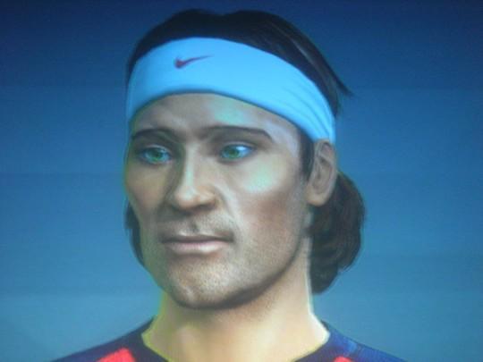
great work on melzer and ferrer, i like them...Melzer is greatly improved, 2 bad i did not keep the pic of my version for comparison...
the only thing i d say for all your caps is try working with some more grain and different complexions : maybe it is the ps3 or the pictures but finding the right grain level / complexion and eye shadows would make your caps less smooth, rougher around the edges, like mine.
I elaborated on this aspect before, but if you look at Moya or Ferrero of mine, you can see i chose very detailed / rich complexions that add the final distinctive touch. Choose another complexion, and they just would not be quite as good.
If you look at the best looking pros featured in the game, i mean nalbandian or becker, notice the complexion is not smooth at all, and the face is grainy as hell with freckles and all...here a few pics in lobby & ingame to illustrate the level of details put into some caps (turn down brightness or add constrast if need because some of the pictures are unfortunately a bit 2 bright):
So my advice would be to try to capture this in future caps as well, especially since you got everything else right working from real life models.
You gotta perfect the eye modeling 2 since it is an area where you seem to struggle a bit on PS3...somehow they detract from an otherwise great cap cause they always seem to be buried to deep in the skull or simply not looking straight, you should try to work more from the side rb view to correct this btw, you rarely post pics from the 3/4 or side view, which is too bad IMO
In a nutshell, the key once you got the basic facial traits in place, is to browse 10mn more to get the right complexion/grain/eye shadow/skin tone combo.Keep in mind that the complexion does have a noticeable side effect on the skin tone, as does the base model you chose. as for djoko, sorry, i know you are trying hard and it is getting closer but still way to generic and a long way from the quality of our 2 soderlings mate ! As i said, it is hopeless since his bulb shaped head is impossible to model
Hope this helps...if you got the patience to read the WOT that is !
the only thing i d say for all your caps is try working with some more grain and different complexions : maybe it is the ps3 or the pictures but finding the right grain level / complexion and eye shadows would make your caps less smooth, rougher around the edges, like mine.
I elaborated on this aspect before, but if you look at Moya or Ferrero of mine, you can see i chose very detailed / rich complexions that add the final distinctive touch. Choose another complexion, and they just would not be quite as good.
If you look at the best looking pros featured in the game, i mean nalbandian or becker, notice the complexion is not smooth at all, and the face is grainy as hell with freckles and all...here a few pics in lobby & ingame to illustrate the level of details put into some caps (turn down brightness or add constrast if need because some of the pictures are unfortunately a bit 2 bright):
So my advice would be to try to capture this in future caps as well, especially since you got everything else right working from real life models.
You gotta perfect the eye modeling 2 since it is an area where you seem to struggle a bit on PS3...somehow they detract from an otherwise great cap cause they always seem to be buried to deep in the skull or simply not looking straight, you should try to work more from the side rb view to correct this
In a nutshell, the key once you got the basic facial traits in place, is to browse 10mn more to get the right complexion/grain/eye shadow/skin tone combo.Keep in mind that the complexion does have a noticeable side effect on the skin tone, as does the base model you chose. as for djoko, sorry, i know you are trying hard and it is getting closer but still way to generic and a long way from the quality of our 2 soderlings mate ! As i said, it is hopeless since his bulb shaped head is impossible to model
Hope this helps...if you got the patience to read the WOT that is !
- VILARCANE
- Posts: 347
- Joined: Mon, 15 Jun 2009 02:54
![]() by sam250 » Tue, 10 Aug 2010 18:08
by sam250 » Tue, 10 Aug 2010 18:08
The grain is right believe me the pictures are a bit weird dunno y, as well, grain and freckles cant really be added too to people wich doesnt have any freckles or much grains, when making my pros, I have folders of 30 images to make them perfect, if a players grain or freckle is high then I put 'em if not, whats the point? it won't look as good!! It is funny caus the pros you posted are actually in real life with a high level of grain so I understand it is perfect, but the level of freckle/ grain for example on ferrer is quasi-inexistant why should I do. When coming to Melzer, believe me his level of grain is 4, maybe the pic doesnt show but anyway thanx for the comments on the eye, my *error* maybe is I bring them upper when I see that the real-life player's eyes are up.
THanx
THanx
PSN: sam25050
-
sam250 - Posts: 320
- Joined: Thu, 17 Jun 2010 15:17
![]() by Yippie-Caiay » Wed, 11 Aug 2010 00:29
by Yippie-Caiay » Wed, 11 Aug 2010 00:29
VILARCANE wrote:btw if someone could tell me how to create an avatar pic for my profile, i dont have a clue, and the faq really does not help...admin, help
maybe, the picture format is not suitable...
btw, vil was not talking about grain, but about complexion...if you choose the right one, it gives a very real look, but you miss on that one, you screw it up...
btw i liked ferrer, but it looks smooth
- Yippie-Caiay
- Posts: 1099
- Joined: Fri, 12 Dec 2008 15:24
- Location: Bs. As., Argentina
![]() by VILARCANE » Wed, 11 Aug 2010 09:09
by VILARCANE » Wed, 11 Aug 2010 09:09
yeah yippie u got my point 10/10, complexion is the key.
As you can see in the pics my caps look more mature, less videogamish, especially ferrero who looks just like the hardened clay court vet he is
Anyway sam, keep it up, dedication is of the essence here, and i know for a fact you will be getting better at it for every extra CAP you do.
off topic again, about the avatar, i just dont know where to find upload it since the option does not appear in my profile if thats where it is supposed to be.
- VILARCANE
- Posts: 347
- Joined: Mon, 15 Jun 2009 02:54
![]() by sam250 » Wed, 11 Aug 2010 09:19
by sam250 » Wed, 11 Aug 2010 09:19
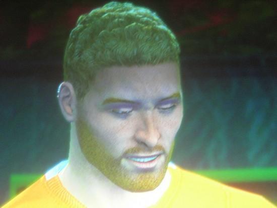
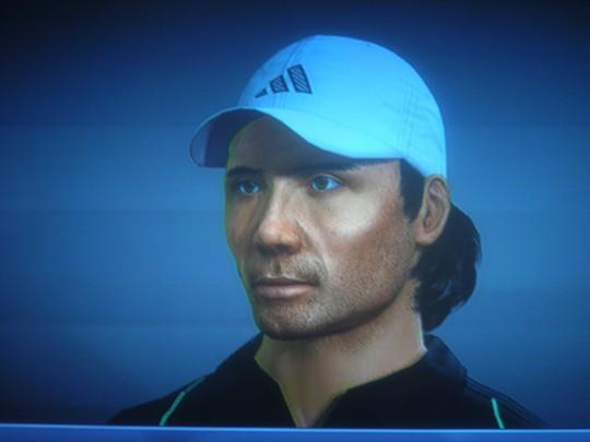
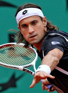
I think this is the right complexion for Ferrer, He is not a player with much traits like Soderling he has a very basic texture as you can see here
here

My point is maybe you guys think I just choose stupidely a complexion to finish it as soon as possible. NO this is not what Im doing , I am taking my time for the complexion aswell and I think I choose the right ones, as I have tons of pictures to help me
here
My point is maybe you guys think I just choose stupidely a complexion to finish it as soon as possible. NO this is not what Im doing , I am taking my time for the complexion aswell and I think I choose the right ones, as I have tons of pictures to help me
PSN: sam25050
-
sam250 - Posts: 320
- Joined: Thu, 17 Jun 2010 15:17
![]() by VILARCANE » Wed, 11 Aug 2010 09:58
by VILARCANE » Wed, 11 Aug 2010 09:58
agreed but sometimes you have to exaggerate/strenghten the facial features a bit to make it look more lifelike / better in-game.
Painstainkingly trying to mimmick the picture can sometimes make you miss the best in game look. Take Gulbis, it is the same, too smooth for its own good IMO.
2 me your Ferrer which is already 8/10 would look better with a slightly darker skin tone, more grain and a less smooth complexion, believe me, try it out on a future CAP if you like...
If you look carefully at the real life pics you posted, you will notice his cheeks are hollow with protruding cheek bones like many spanish tennis players have, using the complexion i used for my moya would help achieve this result.
Your Soderling, it is perfect, cause you took the complexion i used on mine, the one with the scar on the left cheek
A pretty good example of this is berdych in TS3, he has a pretty smooth complexion and face IRL, but not at all ingame, even though he was most face scanned, if you see where i am going...
But this is just my 50 cents, never meant to hurt your feeling, and i understand you defending your hard work, used to do so 2 before with my own CAPs...
So again thanks for your work, and don't misinterpret my posts, just trying to give you a few tips, and you are of course free to ignore them if they sound stupid or self-evident to you, no sweat mate
Tell me and i stop immediately, i dont wanna discourage you, k !
- VILARCANE
- Posts: 347
- Joined: Mon, 15 Jun 2009 02:54
![]() by SoundfSilence » Wed, 11 Aug 2010 11:32
by SoundfSilence » Wed, 11 Aug 2010 11:32
Vast improvement on Melzer, it's really good sam well done


- SoundfSilence
- ITST Tournament Host
- Posts: 1323
- Joined: Tue, 10 Feb 2009 22:19
- Location: UK
![]() by sam250 » Wed, 11 Aug 2010 14:54
by sam250 » Wed, 11 Aug 2010 14:54
VILARCANE wrote:agreed but sometimes you have to exaggerate/strenghten the facial features a bit to make it look more lifelike / better in-game.
Painstainkingly trying to mimmick the picture can sometimes make you miss the best in game look. Take Gulbis, it is the same, too smooth for its own good IMO.
2 me your Ferrer which is already 8/10 would look better with a slightly darker skin tone, more grain and a less smooth complexion, believe me, try it out on a future CAP if you like...
If you look carefully at the real life pics you posted, you will notice his cheeks are hollow with protruding cheek bones like many spanish tennis players have, using the complexion i used for my moya would help achieve this result.
Your Soderling, it is perfect, cause you took the complexion i used on mine, the one with the scar on the left cheek
A pretty good example of this is berdych in TS3, he has a pretty smooth complexion and face IRL, but not at all ingame, even though he was most face scanned, if you see where i am going...
But this is just my 50 cents, never meant to hurt your feeling, and i understand you defending your hard work, used to do so 2 before with my own CAPs...
So again thanks for your work, and don't misinterpret my posts, just trying to give you a few tips, and you are of course free to ignore them if they sound stupid or self-evident to you, no sweat mate
Tell me and i stop immediately, i dont wanna discourage you, k !
I didn't take it that way LOL and please DON'T stop your comments caus they are one of the only things making me improve
PSN: sam25050
-
sam250 - Posts: 320
- Joined: Thu, 17 Jun 2010 15:17
Who is online
Users browsing this forum: No registered users and 0 guests